Challenges
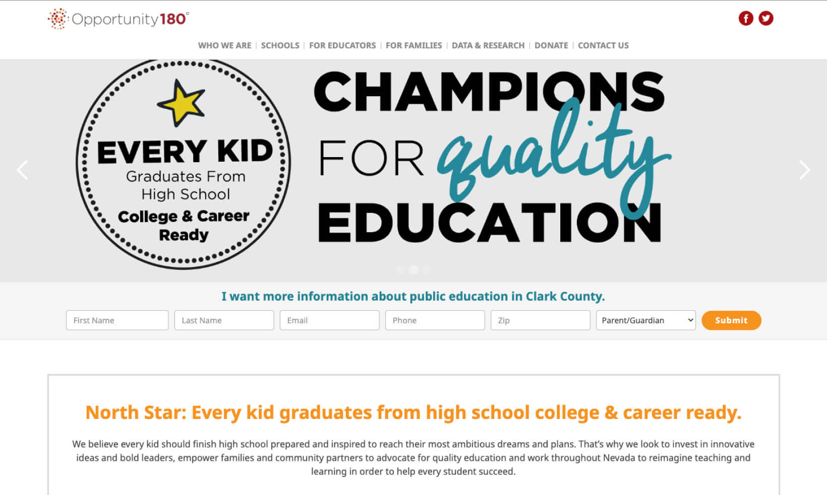
Opportunity 180 drives educational success by striving for college and career readiness for every student, aiming to expand access to high-quality education seats for 100,000 more children by 2030 through a strategic five-lever approach, further enriched by an array of programs, partnerships, and opportunities that actively engage the community. Their current website struggled to tell their story, which needed to be tailored to multiple different external audiences. Additionally, it lacked the convenience of being mobile-friendly and easily updatable through a content management system (CMS).


Mission
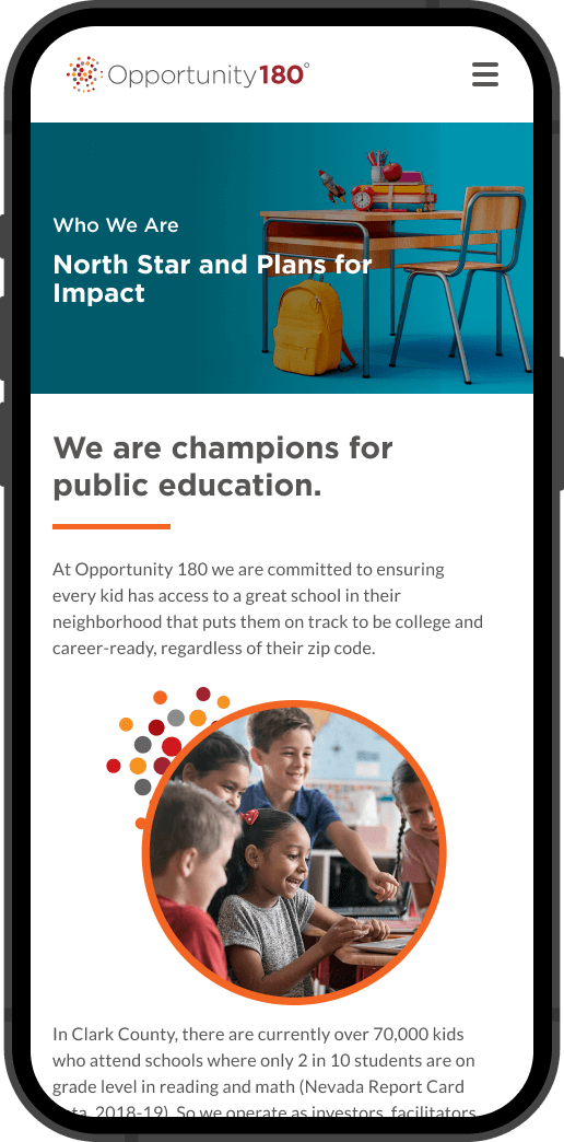
Our mission was to vividly narrate their story, highlight their impact, and foster engagement. This entailed a comprehensive revamp, integrating seamless navigation and translations for accessibility. We planned to enhance responsiveness, simplify updates, and connect with other Opportunity 180 portals. Beyond aesthetics, our focus was creating an interactive platform that informs, engages, and empowers.
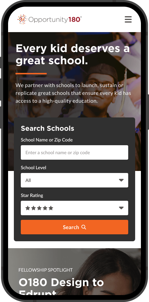
This project encompasses various aspects: from articulating Opportunity 180’s narrative and interactive web development, to integration with existing platforms and fostering user-friendly updates. The site’s design was to be in line with Opportunity 180’s identity, ensuring mobile-friendliness and accessibility compliance. We needed to offer multilingual options, incorporate social media, and provide an engaging user experience through diverse content styles. Technical aspects, such as a well-documented code base and easy content management, ensure scalability and efficient maintenance.

Victories
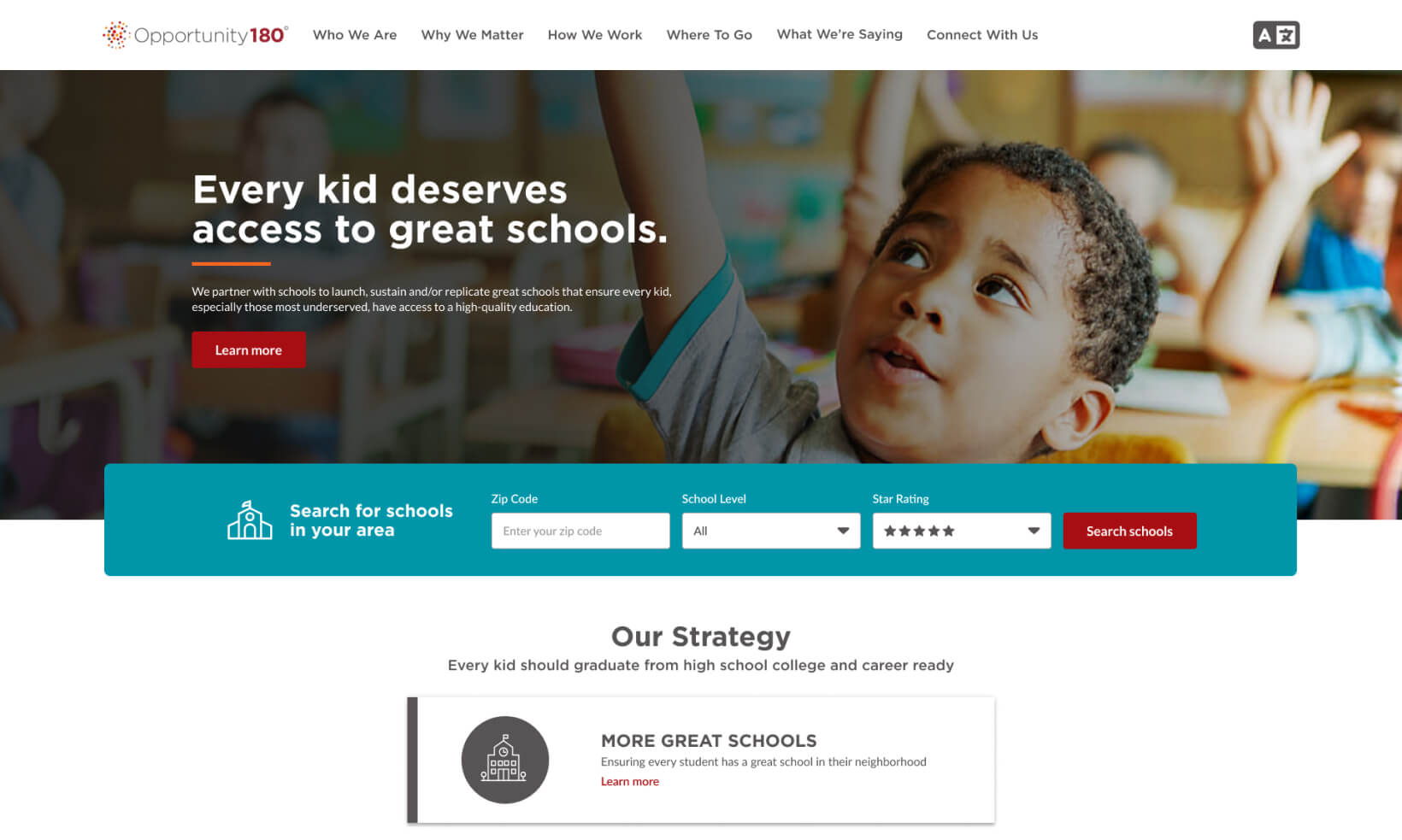
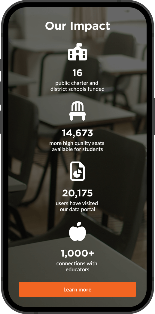
Through collaborative efforts, we revitalized Opportunity 180’s website. The result of meticulous planning and creative synergy, the website now elegantly narrates Opportunity 180’s mission, showcases their impact, and fosters dynamic engagement. With seamless navigation, diverse content formats, and multilingual options, the site has evolved into an inclusive community space that informs and inspires. The integration of a user-friendly content management system empowers Opportunity 180’s team, while design consistency, enhanced accessibility, and cross-browser compatibility create a fluid user experience. It’s our hope that this new site spread Opportunity 180’s mission to create a brighter future in Nevada’s education landscape.
Comparison of Before and After Redesign
